Landing page optimization
In the last part of our blog series on conversion rate optimization, you will learn practical tips on how to optimize your landing page and achieve your desired goals.
Tips on text design
Experiment with the text design. There are three different ways in which users consume landing page content - skimming, scanning and reading.
When skimming, the user skims the landing page for the first time and only pays attention to visual hotspots such as headlines, images, CTA buttons and other eye-catching elements.
When scanning, the user takes a closer look. H2 and H3 headlines, image captions, lead texts and the first and last elements of lists are the focus here.
If the user is now seriously interested, they will take a closer look at the content in the reading phase. It is only here that inconspicuous elements such as continuous text, image details and the middle elements of lists are taken into account.
This makes it clear that it makes no sense to hide important information, the RRP or product benefits in long texts. They should be visible at first glance in order to be effective and relevant in the first two reading phases. Avoid stock photos and use eye-catching images to convince people of your offer and showcase your product right from the skimming phase. Choose eye-catching call-to-action buttons and always place the strongest sales arguments first and last in your bullet point lists.
Target group-oriented approach
Tailor your landing pages to the traffic. Take into account the context of previous interactions and therefore also the origin of your visitors. A visitor coming from a Pinterest campaign probably expects more image-rich content than a searcher from Google. Regardless of where you place your campaign, there must be a certain fit between the landing page and the advertising material to increase the user's perception of relevance when they reach your landing page. You can achieve this by placing certain anchors in your advertising material that the interested party will find again on the landing page. These can be images that appear in the ad and landing page or keywords from your Google Ad that appear in the headline and subheadline.
With Google Ads, different landing pages should also be placed depending on the keyword in order to improve the perception of relevance. Booking different keywords and directing all traffic to a single landing page makes no sense. On the one hand, it has a negative effect on the quality factor that Google calculates itself. On the other hand, more specific landing pages pick up users better and improve the conversion rate.
Powerful testimonials
Make your testimonials seem more real. The more specific your advocates are presented, the more they influence the user. Testimonials that seem inauthentic or fake at first glance are more likely to destroy trust than build it. Add details such as name, age and profession to make them seem more genuine. In the best case scenario, adjust the testimonials depending on the traffic source. If you are delivering your campaign to young women, then also depict young women. This will increase the perceived relevance of your offer, as visitors can identify better with the advocates. Studies have also shown that visually presented testimonials have a significantly better effect than purely textual ones. Within the visual presentation, testimonials in video form are even more effective than images.
Delete unnecessary form fields
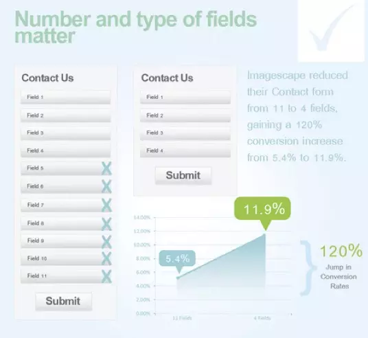
Only use form fields that you really need. Filling in form fields means effort for the user. This contradicts the convenience factor from André Morys' model. Imagescape, for example, reduced the number of fields from 11 to 4 and thus increased the conversion rate by 120%. On NeilPatel.com, only one field was removed and the conversion rate increased by 36%, while at Marketo, limiting the number of fields from 9 to 5 resulted in a 34% increase in conversion. Conversion expert Michael Aagaard from Unbounce, on the other hand, had a different experience. He reduced the number of form fields from 7 to 5 and noticed a -14% drop in the number of forms sent. The reason? He said he removed the fields that visitors liked to interact with and left the ones that were particularly annoying (e.g. phone number etc.). When he added them back and simply changed the names of the fields, the conversion rate rose again by +19%.
Gaze cueing effect
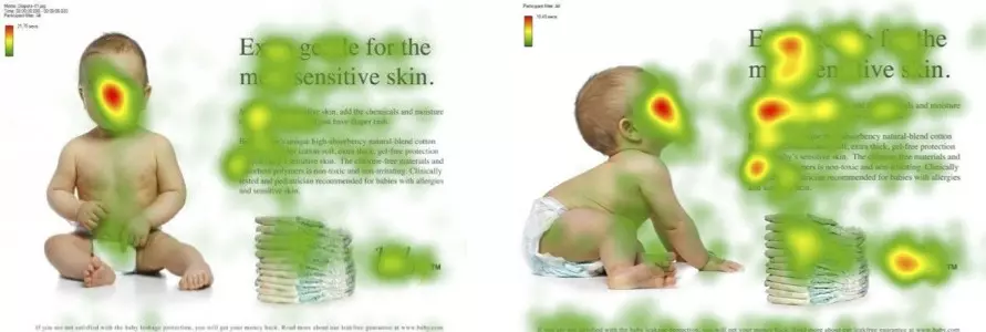
The gaze cueing effect states that we like to look where others are looking. Like many other neuromarketing effects, this is evolutionary. Imagine you are walking down the street and everyone is looking up at the sky. It's almost impossible not to follow people's gaze and look up at the sky too. In conversion optimization, images of people looking at call-to-action buttons or relevant sections have therefore proven to be effective. Images of people looking directly at the user have proven to be less effective. The reason for this is the "facial distraction effect". We analyze the facial expressions of people who look at us. This consumes resources and binds our attention. The "visual cueing effect" is also effective. Instead of people, graphic elements (e.g. arrows) are used to draw the user's attention to CTAs.
Extremeness Aversion
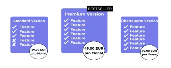
Work with the Extremeness Aversion. Do you offer products in different versions (e.g. from standard to luxury)? Then this tip is worth its weight in gold. In situations characterized by uncertainty, people tend to avoid extreme decision alternatives and prefer a compromise. In situations with three products, the cheapest seems unsuitable as it is associated with poor quality. The most expensive, on the other hand, appears to have superfluous or non-essential features. As a result, the middle product is chosen as a compromise with the best price-performance ratio. The most expensive product therefore serves as a reference value for the selection decision and emphasizes the advantages of the middle product over the cheaper alternative. So if you offer several product variants, it can make sense to display an additional, overpriced premium version on the landing page in order to boost sales of the cheaper alternatives. The effect is particularly strong if you also work with graphic highlights.
Test call-to-actions
There is no such thing as the perfect call-to-action button. However, CTAs also offer a good starting point for optimizations and tests on your landing page. Good CTAs fulfill three requirements:
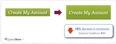
1. they should be eye-catching: therefore experiment with different colors, sizes and positions of the buttons. Caution! Less is sometimes more. Many marketers fall prey to the urge to make CTAs as large as possible in order to increase conversion rates. But this doesn't always work. Here too, the tip is: test, test, test!
2. they should be inviting: Ask your visitors to take action. Labels such as "Buy now" or "Learn more" have established themselves, but more specific prompts can also make sense. Are you selling a fitness program? How about "Buy now and get in shape"?
3. they should be self-explanatory: It must be clear to the user what will happen when they click on the button. Accordingly, call-to-actions should only ever be aimed at a clear action. A CTA that says "Request a quote or more information now" therefore makes no sense and demonstrably reduces the conversion rate.
Also integrate several buttons on your landing page. Don't make users scroll unnecessarily if you expect them to take an action. Every element on the landing page has the goal of convincing visitors of your offer. So offer them enough opportunities to express this conviction in the form of actions.
Bandwagon Effect
Humans are herd animals. The bandwagon effect is based on this fact and states that people are more inclined to buy a product if others have already bought it. This is a cognitive bias in which a decision is not made based on functional benefit characteristics, but rather on the popularity of a product in the peer group. This effect is often used on landing pages with phrases such as: "Already 100,000 happy customers" or "already over 12,000 downloads". Therefore, test the integration of such information.
Did you like the blog series on increasing conversion rates with the help of landing page optimization? Then leave us a comment or suggestion! We look forward to your feedback.
